A HOSTEL ENVIRONMENT
A 17 year old hostel chain, definitely in need of an update? Enter the rebrand. Brittany Golob reports on the transformation of Generator
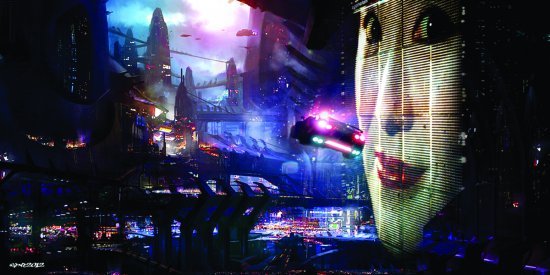
A weary traveler sets his bulging backpack down, surveys the cheerfully painted walls and steps up to the reception desk. He’s booked in for the night, but can’t remember what the name of the hostel – or for that matter, the city he’s in – actually is. He collects his keys from the vaguely interested staff member before heading up to find his bunk on the third floor. On the way up, he passes other people who say hello in a variety of languages and reads signs in several more. Alighting on his assigned floor, he drops the backpack before fishing out his key and picking out a suitable-looking bunk.
Generator is hoping to change all that.
 A lightning bolt of energy has rocketed through the 17-year-old hostel chain, spreading waves of electricity into the drawings, colour and character of its eight branches across the far reaches of Western Europe. The ripples are still reverberating through the company – in both its physical and its brand architecture. From London to Hamburg, the current of change has touched everything from the way the receptionist handles the weary traveler with his backpack to the way the signs look directing him up the stairs, from the people who say hello to him to the activities available to him in whichever city he happens to be.
Generator hopes the power of the rebrand will establish the company in a category of its own, somewhere beyond the standard backpacker fare and becoming part of the intrinsic fabric of the backpack itself. The company wants to redefine European travel and hospitality; a lofty goal for a company that had two hostels to its name just a few years ago.
“You want this to be a brand that someone is happy to buy a t-shirt with your logo on it,” Matt Cridland, creative director at Bisqit, the design agency who carried out the rebrand, says. “It should be seen as a lifestyle brand, as a cool brand that people want to buy into and that people understand what it stands for.”
The new logo may achieve that. It emerged from a variety of pictograms symbolising power, energy and a computer’s on/off indicator. The result was a lightning bolt striking through a hand-drawn G. It was from that thunderbolt that the tone of the reband flowed.
In October 2011, Patron Capital, a private equity firm, invested £87 million in what was then a familyrun company with outposts only in London and Berlin. With a trend toward budget accommodations in light of the recession, hostels have become a fastgrowing market attracting everyone from the typical backpacker on a gap year to families on a budget to seniors on a city break. Patron’s oversight of Generator has been driven by the vision to have 15 properties by 2015. Generator chairman Carl Michel notes that the rebrand will not only address this objective but also establish the Generator brand in the minds of its guests and provide a “clear and sharp identity” with which its stakeholders can identify.
Even a quick look at the pre-rebrand visual identity is enough to know that it was sufficiently bland and uninspiring; a lime green G adorning the front of a hostel in a sea of lime green hostel frontages, drop-shadows and disjointed typefaces.
This, alongside the objective to reflect the style and social nature of Generator’s character in its design prompted the group to seek out Bisqit to revamp the brand structure of the hostels. Anwar Mekhayech, of The Design Agency, the brain trust behind The Soho House, had just overhauled the design of the two newest hostels, driving Michel and the team at Generator to pursue a brand that better reflected this new direction.
In April, Bisqit began to visit some of the hostels, including the former police station that is the London locale and the Hamburg hostel that was once home to a Beatles recording studio. Generator’s passion for “injecting new life into old buildings and recycling the urban fabric,” as Michel says, resulted in Cridland and account leader at Bisqit Shelley Murdoch developing two variations of the new branding. One, which Cridland describes as “a bit more Hoxton”, was tossed out in favour of a colourful, hand-drawn identity with an emphasis on the social element of travel.
Michel says the new branding allows Generator to use a youthful tone of voice to better address its customers’ needs. He says, “Since joining the team in August 2011, it has become increasingly apparent to me that our branding – created when we had just two hostels in place in London and Berlin – no longer reflects the stylish and social elements at the heart of our properties.”
That social element drives the personality of the new Generator brand. The hostels themselves feature meeting spaces, art galleries, live music venues and a Generator Jukebox, allowing visitors to choose what music is played in the hostel. Bisqit approached that attitude by redefining the tone of voice of Generator’s brand and communications and by using photographs that capture moments, emotion and energy.
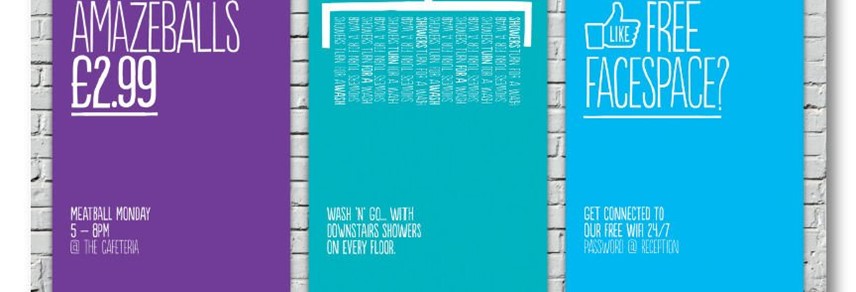
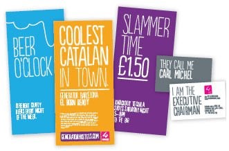
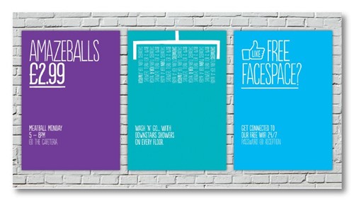
Cridland says the company’s tone was revamped to imbue personality into the visual identity and the atmosphere in the hostels themselves. Bisqit developed wayfinding and signage for use in the hostels, sometimes in up to three languages. They used slang, humour, elitist wit and youth-driven phrasing to connect with visitors. “It’s important to have a piece of attitude in there, Cridland says. “That’s what was missing in the brand before.” Murdoch adds, “Chains don’t have personality. Boutiques have attitude.” The Bisqit branding certainly has attitude. Even Michel’s new business card boldly declares ‘They call me Carl Michel. I am the executive chairman’. The wayfinding benefits from puns and wordplay and features clever illustrated icons depicting, among other things, where the pool tables are and the correct toilets for men and women.
The new attitude suits Generator as it repositions itself as the market leader in design-driven boutique hostels with local flavour. Each hostel is unique, just as each city in which Generator has a presence is different. The urban design reflects both the infusion of the new tone of voice the rebrand set out and the identity of each city.
Michel notes the interaction between design, branding and character. He says, “With bespoke décor in the public spaces of each hostel, every property we open is designed to reflect the local culture, with an acknowledgement of global youth such as the graffiti art in Dublin. Anwar’s involvement is key to helping ensure each hostel combines signature Generator elements such as great service and welcoming social spaces, where guests can interact as little or much as they like, with some flavour of the city that you’re in. Working with local architects really helps give each hostel a sense of place.”
Similarly, Bisqit’s design aimed to give the Generator brand a sense of place in a crowded tourism market. “I think it’s a radical change for them,” Cridland says. “This takes them into being a credible player and redefining the hostel experience. It has almost moved them into a category on their own.”
The lightning that electrified Generator’s branding has reverberated through Mekhayech’s design, too. Turning functional spaces like meeting rooms and bars into modern, energetic designs not out of place in a Hoxton cafe or a Soho bar. Each location captures aspects of local youth culture. Copenhagen’s art gallery showcases homegrown talent while Dublin’s highlights the city’s music scene. Dublin is also located in Smithfield Square, next to the renowned Old Jameson Distillery.
Emphasising the art, music and culture of Europe’s biggest cities not only recharges hostel design but encourages visitors to engage with these aspects of tourism. “That’s why at Generator we encourage them to come out of their rooms and have focused on creating design-led spaces offering a variety of seating areas where they can happily hangout with friends, listen to music, join in one of the local events we’ve laid on showcasing local talent or simply catch up on life back home taking advantage of the free WiFi,” Michel says.
That approach to culture does not stop at design. Generator’s Twitter feed is rife with notices for street art, galleries and cultural events and the company’s blog addresses topics of interest to its clientele.
 But a rebrand involves more than just reclaimed wood, graffiti art and wayfinding graphics. For Generator’s recharged rebrand to channel through the organisation, a redefined approach to customer service was called for. Bisqit’s hand-drawn identity emphasises the human face the brand is putting on boutique hostels. The company carried out intensive in-house training for its hostel and head office employees to ensure that strong customer service translates to a memorable experience that creates loyal customers of the Generator brand.
Cridland says that drawing the staff into the rebrand creates consistency and a sense of energy surrounding the Generator brand and experience. Murdoch says, “The customer experience is going to be coloured by the people in the hostel providing you with that service. It’s about trying to bring the brand to life through the employees.”
Employees were retrained to work within the guidelines set out by the rebrand. Bisqit’s brand guidelines introduces the tone that communications and customer service should take on and highlights the use of compelling, topical photography.
Cridland says the attention to service and design should strengthen the brand in the minds of travelers who then may do the ‘Generator tour of Europe’. The revamped locations are already becoming some of the most popular destinations for travelers. In October, the Dublin branch was named the ‘Favourite Hostel in Ireland’ at the TNT Golden Backpack Awards. The Dublin outpost is also the ranked as the second-best hostel in the city by TripAdvisor. Its reviews lauding various aspects of the redesign from the social value of a Generator hostel to the attention to service. The Hamburg branch is ranked at number one in the city with similarly strong reviews.
Design, branding and customer service have come together in the eight branches of Generator.
Michel says, “We want to transform not only the hostel experience but the hospitality industry’s understanding of the space and capitalize on our first-mover advantage in developing a distinctive brand with wide appeal. Having a more contemporary brand image is a key part of that mission and will allow us to act, and communicate, like the market leader we aspire to be.”
A flash of lightning has channeled its energy through the Generator brand. Maybe now, the weary traveler will set down his bulging backpack in a reception area of world-class design quality, interact with an energetic staff member before following the hand-drawn wayfinding signage up to his room. Maybe he’ll stop and chuckle at the clever graphics on his way back down to the common area where he’ll take a look at photographs by a local artist and chat with his fellow travelers over a cup of coffee. Maybe he’ll do what Cridland suggests and take the Generator tour of Europe.