EYES ON THE SKY
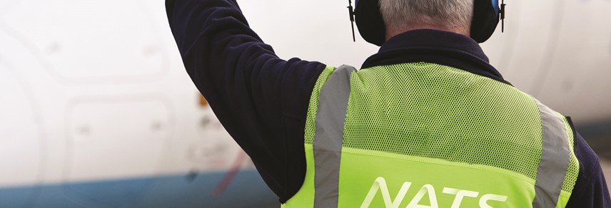
Managing the UK’s air infrastructure falls to air traffic control organisation NATS. How has its new brand united the business and ensured it has a more successful communications strategy? Brittany Golob reports
In 1928, the world’s first air traffic control operators directed planes to and from Croydon Airport, in south London. The now-defunct airfield also invented the ‘mayday’ distress call and the customs charge, among other things. Its contributions to the world of air travel live on, in one part, through NATS, formerly known as National Air Traffic Services.
NATS is a public-private organisation commissioned by the UK government to oversee and maintain the air traffic coming into and out of UK airspace. It also operates in Spain, on UK military bases and in association with military operations around the world. It’s a B2B organisation that is responsible for thousands of flights every day, but like the infrastructure it operates, is largely unseen.
Though there are designated routes that planes adhere to when flying into UK airspace – “highways in the sky,” according to the Team, the London-based brand agency that developed the NATS rebrand – few outside of the aerospace industry are likely knowledgeable about them. But those highways, much like the ribbons of roads that snake across the UK, are a vital national infrastructure. They became an equally vital component of NATS’ new brand.
But first, the Team had to figure out a way to make the invisible, visible.
It began within the organisation itself. Jonathan Palk, head of marketing and communications at NATS, took the idea of a brand refresh to the executive committee. The Team then came on board to redefine the organisation’s purpose and work toward a One NATS approach, internally. The previous brand strategy was called ‘Performance through innovation.’ But, with a new contract to negotiate, it was the right time to examine the positioning. “It felt that we were at this step and we were failing to describe what we were in service of,” Palk says. He says a bulky and inefficient visual identity compounded the need for a new brand.
The Team began working with the organisation and arrived at a new proposition that embraces both NATS’ adherence to safety and its boundary-pushing outlook, ‘Advancing aviation, keeping the skies safe.’ But this statement itself was not so much a shift as a verbal realisation of what the organisation already stood for. These two elements – safety and innovation – formed the basis for the new positioning.
The Team developed four further principles from which to work, ensuring that the brand would remain agile, human, transparent and precise. In determining how to bring those qualities to life visually, the Team’s creative leader Dave Recchia and MD Kevin MacKenzie, stumbled upon the answer by chance in a Berlin bookstore. On site for work with another client, Recchia and MacKenzie were browsing when Recchia came across the work of photographer Joel James Devlin. The expert in low-light photography had made a hobby of photographing planes arriving at airports across the UK. The distinctive tail lights make for riveting long exposures that show flightpaths in long vectors across the sky.
His photography would become one of the key elements of the brand. The photos, dubbed ‘skyways’ in the NATS brand nomenclature, form a library of images location stamped by longitude and latitude, for ultimate precision. Devlin says, “A great skyways photograph is a combination of a very beautiful or dramatic sky as a background to very elegant vectors or light trails left from aircraft. My part is framing that beautifully, often without being able to see exactly what I’m framing. It’s tricky, and a little bit of luck always comes in at the end.”
Recchia says there were three photographs used from each of the six airports photographed – one depicting the flightpaths in the sky, another showing the airport infrastructure and a third including the airport’s control tower. Thus, all of NATS’ services are represented by the photography. And, for the first time, NATS was able to make its infrastructure visible. Palk says, “Through applying long exposure photography, we’re able to bring to life a quite beautiful, aesthetically pleasing medium. It gave real personality to different airports and pieces of airspace. There’s absolute accuracy in what we portray in that photography and it is truthful and recognisable.”
The photos themselves are intriguing, but they become integrated into the brand through NATS’ new logo. Originally, NATS was not looking to reexamine its logo. It initially sought only to build a new purpose and galvanise its internal audience. But, Recchia says the new purpose was not supported by the existing brand or verbal identity. “If they went forth with the current logo,” he says. “It wouldn’t honestly embrace and reflect the new purpose.”
Palk and the brand steering committee within NATS agreed to examine the logo. Previously, the four letters of NATS were drawn in black and white, with a wide, curved N and italicised font. Palk says the logo was “well-loved” and NATS was concerned about changing it. However, he adds, “Fundamentally, it didn’t express the story of who NATS was. It was just four letters in a row.”
The Team faced a few challenges when approaching the logo. The first was the static nature of the previous wordmark, which belied NATS’ focus on fluidity and forward motion. The second was the need to unify the four characters with a single type style. The third was to ensure the result would be identifiable across digital and social applications and the fourth, was to make the logo more versatile.
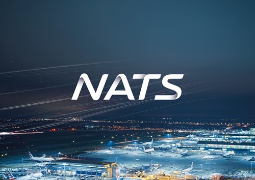
Recchia says, “One of the things that we wanted to convey is that NATS gets planes off the ground and up to 30,000 feet and out of UK airspace, and it does the same on the way in. There’s a lot of depth in what they do and we wanted to convey that in the mark, which is why we brought that gradient into it.” The resulting logo is silvery-grey with a slight gradient that visually carries through the wordmark. When applied to the photography, the logo is semi-opaque, meaning the skyways photography can be seen through it. On social, the N can be used in isolation, representing all of NATS, but still visible in small icons.
The logo and photography are visually arresting and give NATS its first real external presence. But, there was still a brand system to complete. MacKenzie says the brand had to reflect NATS’ new positioning as well as replace an inefficient existing brand identity system, “What we had to do was get NATS’ positioning across all of the elements or some of the elements consistently, in a way that was authentic.”
First was the colour palette. For the two main colours, the Team carried out extensive research into the colour of the sky and developed two subtle gradients dubbed ‘twilight blue’ and ‘midnight blue’ to represent NATS operations. Supplementing those gradients were four additional accent colours: pink, blue, orange and green. However, those colours were not chosen on a whim. The air traffic control (ATC) system NATS is deploying features those same four colours across a matte black background. Radar officers in particular will be familiar with this colour scheme and the way that it organises flights on the screen. “The new brand colours are taken from the two worlds where we interact with our customers, in the sky and on our radar screens.” Palk says.
Those colours are used to highlight messaging and in graphic icons and devices within the brand system. The Team developed icons to depict NATS services and offer guidance around the website and iPad app. Those icons are comprised of a single line – representing NATS’ job of getting planes from A to B – where possible. “Pilots get all the glory,” MacKenzie says. “But NATS are the unsung heroes that people don’t think about. They don’t think about when they take off at airport A and go to airport B, it’s not just the plane and safety checks, it’s also very much the ground control that is keeping that aircraft safe.”
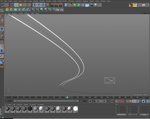
Four flightpath graphics were also designed to flow through the visual identity and allow for simpler implementation by NATS’ in-house designers. They were derived from the true-to-life flightpaths of different aircraft including a 747, a Cessna, a military craft and a helicopter. Each of the flightpaths was assigned one of the four accent colours. The font was updated to Roboto, a Google font, for both internal and external use. It, too, is one of the fonts used on NATS’ ATC system.
Finally the verbal identity and tone of voice were examined, with one main goal: make it more human. MacKenzie says, “NATS wanted to come across as being human. That first person, human voice is essential for people to actually connect with the business and connect with the brand and not to make things complicated, because air travel shouldn’t be complicated.” The Team, when determining how the tone of voice should be developed, wanted to eliminate the jargon, the scientific complexity and the corporate-speak from NATS’ communications.
All of these elements bring the NATS brand together, visually and aurally, but behind it was the drive to be a more unified company, brought together behind a single mission. Doing so would help NATS form a more consumer-friendly face as well and allow it to engage with the public more regularly. But bringing the internal audience on board was important to the brand’s success. When the previous brand rolled out seven years ago, Palk says it was difficult to get employees behind the brand. NATS wanted to avoid the same mistakes this time around.
The Team and the brand steering committee worked with employees from across the business both in the development stages and in the roll out to ensure that the brand wasn’t just something created by communications and marketing and foisted upon the rest of the organisation, but that it was something that could bring NATS together. “What this has allowed us to do is enable people to stand a bit more closely together,” Palk says. “Whether you’re an engineer, a controller or a financial expert, there is more of a shared understanding of what we are for.” For external stakeholders, the impact is no less dramatic. “A brand should be an enabler,” Palk says. “It should encourage your audiences to better understand what you are for and why that’s helpful. We’re more easily seen as a company that has relevance, that has value, that helps its customers achieve their goals and keeps the skies safe for aviation.”
It has been 89 years since the first air traffic controller directed planes to and from UK airspace. NATS adheres to the same high standards it always has, pursuing innovation and safety. But its new brand now better prepares it for the next era in British aviation.
Peer review
James Packer, creative director, Industry
The Team’s evolution of the NATS brand is to be applauded. A well executed statement of heritage meeting modernity, the new identity draws inspiration from the organisation’s past, but by employing subtle letterform refinements succeeds in creating a logotype that is both bold and distinctive. The introduction of the new flightmark logo, coupled with the consistent use of colour and a refreshed graphic design system achieve a sense of precision and accuracy, that embody the brand’s core values.
It is also refreshing to witness the use of photography to distinguish NATS within the navigation services industry. Typically saturated with illustration and retouched stock photography, the new NATS identity claims new territory within its competitive sphere by boldly embracing the real craft of photography. Particular congratulations go to photographer, Joel James Devlin, whose unique and daring style results in a set of impactful and evocative images that capture the essence of the NATS proposition, ‘Advancing aviation, keeping the skies safe.’
The Team has done an admirable job of taking a well-known but ageing brand and making it relevant in today’s customer-focused and digital world.