FIRING UP
One company’s longstanding relationship with fire has enabled it to rekindle its focus on progress, innovation and scientific research. Brittany Golob reports on RHI Magnesita’s new brand
Since the earliest days of man, people around the world have worshipped fire. Gods bearing the name Logi, Hephaestus, Vulcan, Huracán, Pele or Ra, among others, have personified fire in religions and traditions throughout time. Diwali, Hanukkah and Christmas are celebrated through the lighting of flames. Bonfires were, and are, used for celebratory and ritual purposes. Even the Olympic Flame – which is alight throughout each Games – remains a symbol of the human relationship with fire.
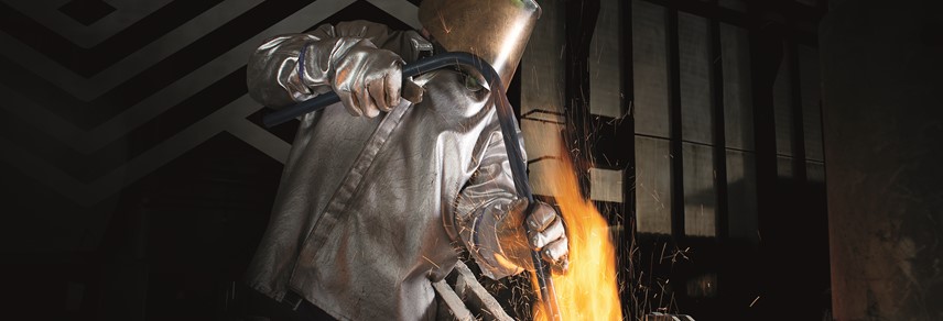
But it’s not only in culture, tradition and religion that fire plays a critical role, but in industry as well. Those companies that keep the ever-burning fires alight are, in German, called ‘feuerfest’ – literally ‘fire firm’ – in translation: refractory. A refractory makes the primary materials that allow other industries to manage manufacturing processes at high temperatures. To do so, though they don’t worship the altar of the fire gods, they do keep a raging blaze alight perpetually. In those fires specialised heat-resistant bricks are baked that go on to line the kilns and protect the machinery in which iron, steel, glass and other basic materials are manufactured.
When two of the world’s leading refractory firms – Austria’s RHI and Brazil’s Magnesita – announced a merger and IPO on the London Stock Exchange, the flint was struck sparking the introduction of a new brand. With a tight deadline and a pressing agenda, MerchantCantos and the team at the newly renamed RHI Magnesita had to strike while the iron was hot.
With the merger taking place concurrently with the brand development and IPO process, there were numerous unknowns and challenges thrown the way of communications consultancy MerchantCantos. But, alongside a team from internal comms and made up of both RHI and Magnesita employees, MerchantCantos plotted a strategy.
“They wanted to talk about being a leader without being explicit. They didn’t want to sound arrogant or big. They wanted to talk about the momentum they were going to create, the impact they were going to have; how they were going to drive change,” says MerchantCantos’ director of brand strategy Kate Stark. To craft a statement of authority, without using boastful language and without relying on jargon, the team focused on the company’s objective of making change in the industry. The refractory business, before the merger, was fragmented, globally. But, with the new super company formed by the merger of RHI and Magnesita, one firm grasped the potential to increase the scale of production, the resources available and the investment in research and development. That has the potential to forge a new future for refractories.
Those factors made it an easier job than most of highlighting points of differentiation. MerchantCantos had solid facts on which to base the strategy; due to the size, power and research focus of the new business. But, that didn’t make the task easy. There was a window of only three months in which to develop the strategy and visual identity, roll out an internal campaign, prepare for the brand launch at the London Stock Exchange and create 30 plus brand assets.
Thus convened a brand team, followed by workshops, leadership meetings and conference calls aplenty. With regards to the visual identity, “The first thing they said was they wanted a symbol that everyone could unite under; something beautiful,” Astrid Kogler, senior designer at MerchantCantos, says. Like many manufacturing companies, neither RHI nor Magnesita had much in the way of visual identity. Each company had a colour – navy blue and maroon, respectively – and a logo, giving the design team a blank slate.
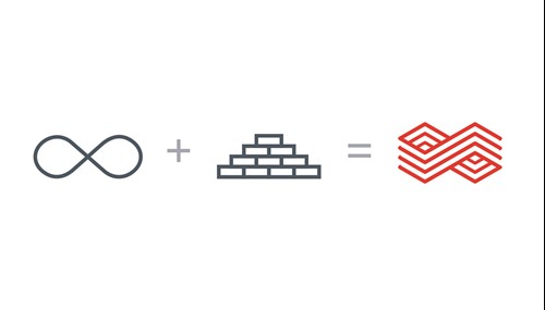
But the logo may have been the most important piece of the new brand. “The logo was to go everywhere,” Kolger says. “On their hard hats, on their lab coats, on every PowerPoint slide. We built the whole system from that logo.” The starting point of almost any raw material production process is what the refractory produces – bricks. So that’s where Kolger started too. The logo is essentially an infinity symbol, but one that has the block-like layering of bricks and indicates a symbolic union of the two companies. It also represents the fact that the kilns in which the bricks are fired have been lit continuously for over 130 years, situating RHI Magnesita in the long tradition of humanity’s relationship with fire.
The result is a symbol that has meaning for the company in real terms, but also intangibly as it refers to longevity, sturdiness and collaboration. The logo then dictated much of the visual identity. Its corners lend their 30 degree angles to a diagrammatic system for use in explanatory material. The logo became a super graphic that can be used across printed and digital material. The curves of the infinity symbol determine the formatting for other brand assets as well. These are all brought to life in a revitalised blue and red colour palette and a blocky, sans serif font.
For science-based organisations, manufacturing companies and B2B firms, design can be difficult to assess and grasp, Stark says this was no different at RHI Magnesita, but the in-house team quickly became part of the design process. “They were all very conscious that this was a heavy, dirty industry and that’s how everyone sees it. They’re trying to move into being more about technology and innovation, being smart and appealing to young engineers. Good design has a role to play in communicating that,” she says. RHI Magnesita came to appreciate the role design could play in achieving its business objectives.
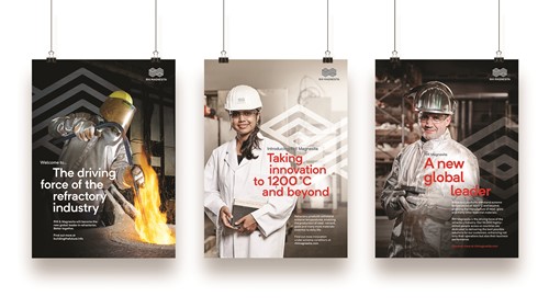
Those objectives ranged from successfully completing the IPO, uniting the two halves of the company through the merger, leading the industry in scientific innovation and attracting strong graduates in science and engineering into the business. To enable RHI Magnesita to actually explain what it means by ‘innovation’ MerchantCantos built the word into the brand positioning. “It was this extreme heat, these extreme conditions where people can’t go. You’ve got robotics, you’ve got sensors, you’ve got materials science. But it all has to operate in an extremely hot environment,” Stark says. The company did talk about these points of differentiation before, but as simple facts, not as a positioning. The new strapline, ‘The driving force of the refractory industry,’ and the punchy mission statement, ‘Taking innovation to 1200°C and beyond,’ give the company that sense of momentum it wanted, without relying on bland language.
The two statements were then applied alongside the super graphic-treated logo in a jaunty alignment that reflects the stacked-brick structure of the infinity symbol logo. But one final element of the visual identity was needed to humanise the refractory business – photography. For recruitment purposes, interesting photography and attention-grabbing statements were a change for RHI Magnesita, which previously had relied on a more fact-and-figures approach. With a set of bold, almost monochrome imagery depicting RHI Magnesita’s scientists and employees in to-camera poses, and the new brand and positioning, the recruitment and internal communications assets have drawn new heat from the hearth.
The new imagery, shot over two days in Austria, complemented a scant library of fire and brick-based photos. The fresh shots lack strong colour saturation, allowing the vivid colours from the rest of the brand as well as the intensity of the kilns and fires to shine through, while still giving the portraits a strong visual theme. The library will be expanded over time and images from the Brazilian arm will be included.
With the design direction and strategy mostly forged, the focus turned to communications. During the merger process, RHI Magnesita determined the shape of the new company’s leadership and structure. But, the merger also prompted the company to relist on the LSE. The brand launch was not to be until 24 October when the company would officially list on the London exchange. But, to ensure employees were kept apprised of the changes, a communications programme was carried out internally to introduce the rebrand and engage staff with the new tone of the company.
One of the pieces of content produced by MerchantCantos was a film of the CEO answering questions about the new company, to be available to employees worldwide. A poster campaign teased the brand, without revealing the new logo. And critically, the positioning was introduced to encourage an attitudinal shift in the approach to problem solving within RHI Magnesita. Finally, during ‘welcome week,’ employee events were run to allow staff in 10 locations to become accustomed to the new brand and positioning, to engage with senior leaders and to better understand the merged business. “Then after that,” senior account manager Andrew Burridge says, “they kept talking about needing new branded socks.”
Then the big day came around at the London Stock Exchange. A video presentation opened the ceremony, finally revealing the brand to the world. The implementation followed, but will be a gradual process as things are replaced when needed. The move to a new office this year will facilitate some of the environmental implementation. Smaller outposts with only one or two employees will be the hardest to reach, but will nonetheless enjoy the fruits of the new brand. This year’s annual report will be one of the highlights for the new brand in 2018. Employees do, however, keep asking for new branded socks.
The new positioning has helped two companies forge themselves into one. But it would have been impossible without a driving commitment from CEO Stefan Borgas who bought into the value a new brand could bring a company like RHI Magnesita. “It is always really rewarding when the client sees the power of brand to do something for their business,” Stark says. “They go from seeing it as a superficial, necessary box to tick through to being something that is a tool to enable them to achieve their business and strategic ambitions.”
The fires at the heart of all of RHI Magnesita’s refractory processes continue to burn, but a new positioning and brand have added fuel to the company’s ambitions. It is one ‘feuerfeste’ that is maintaining the connection between human knowledge, cultural change and scientific progress through its relationship with one of the most essential of elements: fire.
Peer review
James Packer, creative director, Industry
Following the merger of global players RHI and Magnesita, the newly formed RHI Magnesita brand brings a long history in the refractory industry into the digital age, and positions the firm as a modern business for the modern world.
The proposition, ‘The Driving Force of the Refractory Industry’ has strong currency in a sector ripe for disruption, and positions RHI Magnesita as a leader in shaping the future of refractory. The opportunity for bringing this sentiment through to the visual identity of the firm is enormous, and has the potential to challenge the industry in a meaningful way.
Photographically, we are presented with a suite of striking and rich imagery that goes a long way to bring personality and gravitas to the new brand. This is supported by ownership of a powerful red and blue colour palette that seeks to signal strength and confidence to the industry. However, the opportunity to draw on the visual cues afforded by a rich proposition has been underexploited. As a consequence, the brand struggles to achieve the cut-through promised by such a bold statement.
The new logo has been well executed and has the potential to unite the brand around a core visual element. However, excessive application of the device, from watermark to image container to repeat pattern, serves to undermine the authority it could have commanded.
The fact that the RHI Magnesita brand is transformative cannot be denied. The new proposition and identity make a play on a number of strong elements that have the potential to drive change within the refractory industry. While individual elements are strong, the brand lacks the essential cohesion and authority required for a successful post-merger brand, ultimately missing an opportunity to create real impact and to unify two businesses for a shared and prosperous future.
For more from Communicate magazine, follow us on Twitter
![]()