PASSION PLAY
In the Netherlands, football is beloved by fans of the Eredivisie. Tapping into that passionate relationship between local supporters and the clubs themselves, Fox Sports Netherlands was able to introduce a new on-air identity more closely aligned to its audience. Melina Thalassinou reports
With faces painted in the colours of their favourite team, hands holding the flags high and chants fervidly yelled, sports fans are known for the extraordinary passion they show for the team they support. Local sports brands gain even more attention from fans, who back not only the team they love, but also the region in which they live, a region that is often where they were born and raised. It’s personal.
In the Netherlands, Fox Sports, the programming division responsible for sports broadcasts and its dedicated regional and national sports cable channels, owned by American multinational mass media corporation, 21st Century Fox, has total coverage of Eredivisie, the highest class of professional football in the country, making it the only way to watch Dutch football. With an impressive number of subscribers that exceed the one million mark, Fox Sports continuously offers content throughout the football season.
However, despite massive support in the Netherlands, Fox Sports Netherlands decided to undergo a rebrand led by branding and creative agency DixonBaxi, to better serve its viewers. Jan Bonjer, director of marketing and creative at FOX Networks Group says, “Since our market in the Netherlands is a typical one that is largely driven by football, we thought we should build a package that better suits who we are as a brand. Also, nowadays stuff gets old, fast. Four years in, our previous package was heavily based on 3D, it was quite sterile and cold; maybe a bit distant and certainly not Dutch.”
Indeed, Fox Sports Netherlands’ previous brand identity was designed in a noticeably US-centric look that didn’t align with the ‘Home of Dutch football’ tagline and didn’t fit the needs of the localised Eredivisie-led focus of the Netherlands brand.
Daniel Capstick, creative director at DixonBaxi, says, “In a snapshot, Fox Sports came over and looked American. It wasn’t appropriate for that region and the audience reacted against the big 3D, the skyscrapers that were represented, the bombastic dimensionality of it all and I think the local team at Fox Sports realised that it felt wrong. They got feedback from the audience that it felt wrong – that it felt like Americans had taken over their league – which is difficult to say but is true. That’s how they felt. In their minds, there were guys in suits across the pond that knew nothing about the Netherlands’ sports. The visual of the channel represented that. The visual of the channel is probably right for some markets, but it was definitely not right for the people in Holland.”
To help understand what the Eredivisie means to the Dutch and to make educated decisions regarding the new visual identity of Fox Sports Netherlands, a small team from DixonBaxi went on a tour of the Netherlands to watch some games. As a result, DixonBaxi gained a better understanding of the Eredivisie itself, as well as of the history of the sports clubs and the fans who support the games.
Harry Ead, associate creative director at DixonBaxi says, “We decided to go on a road trip across Holland, watching some games and the biggest game of the season between two of the most established football clubs, something like the equivalent of Manchester United versus Liverpool. That introduced us to a certain size of Dutch football and then we decided to head out to watch a more middle-of-the-table clash, where we really saw the passion of Dutch football.”
Following the tour, DixonBaxi produced the guidelines the rebrand would be based on. The four guidelines, ‘be the home of Dutch Football,’ ‘if we’re courageous, the audience will embrace us with a passion,’ ‘amplify stories to create a genuine authenticity’ and ‘embrace a new generation of fans,’ gave both DixonBaxi and Fox Sports a direction that served as a reference point to the brand’s internal and external communication.
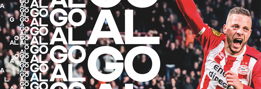
The most direct way to give the Fox Sports Netherlands brand a localised feel was by adopting a minimalist and abstract approach, stripping back the logo to its most recognisable elements and updating the typography. The new logo is simpler and offers adaptability across the brand’s touchpoints. “It’s a signifier of change,” Capstick says, “A signifier that it is no longer a broader 3D-pebbled brand world. The reduction and refinement of the logo brings it in alignment with the attitude that we created. It’s slicker; it’s simpler; it’s cleaner.”
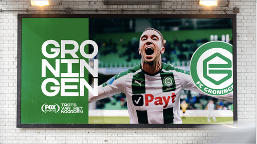
DixonBaxi managed to convert Fox Sports’ global identity into a locally focused one. Ead, says, “Fans usually are more passionate about their clubs than they are about the league, so we contemplated on how to bring the colours and the badges into the design language more, because those are what the people respond to and resonate with.”
“Fox Sports came over and looked American. It wasn’t appropriate for that region and the audience reacted against the big 3D, the skyscrapers that were represented, the bombastic dimensionality of it all and I think the local team at Fox Sports realised that it felt wrong”
He adds, “We also looked at the language that surround the league, for example the chants and songs that people sing in every single game, and how we could embed that language into the look and feel of the channel. We had the core colour palette at Fox with distinctive colours and we highlighted and made the use of the crest integral in different kind of layouts and formats. With simple things like putting the Fox logo next to club logos, we gave a sense of unity between the Fox brand and the clubs that people love.”
A simple square grid system is the focal point of the new visual language and can be seen in every aspect of the design, from the bespoke typeface to all graphics. Furthermore, its size and position can interchange seamlessly, creating the illusion of movement.
DixonBaxi worked with type designer Ondrej Jób, founder of Slovak type foundry and graphic design studio Urtd, to design a bespoke typeface for Fox Sports Netherlands called ‘Sparta,’ in honour of the oldest professional team in Dutch football. Sparta offers an almost rustic graphic style which reflects the brutal energy of Holland’s passionate fans. The typeface’s unique square and monospaced shape fits the grid-based structure the entirety of the rebrand is based on and provides fluid motion, mimicking the motion of the team.
DixonBaxi drew inspiration from ‘total football’ for the entire design language. Total football, a style of game which was made popular in the 1960s and 1970s, is a fluid style of play, and DixonBaxi was inspired by that to design a visual language with an invisible grid, where elements could move, could be elevated and be adaptable to scale. “The typeface was born out of that. We had this square grid system and we wanted a typeface that would work perfectly within that graphic language. We came up with a typeface that has a certain attitude to it. It’s a little bit awkward and brutal in moments, but it has an attitude that reflects the football crowd. It moves as a group of people, it’s quite upfront and very bold,” says Ead.
The new typeface was the biggest risk Fox Sports Netherlands took in the context of the rebrand. Bonjer says, “Changing stuff is always a risk. If we talk about the specifics of the design, I think the biggest risk we took was the typeface, just because it was so different from the previous one.”
When designing the brand, both Fox Sports Netherlands and DixonBaxi put the fans at the centre of their objectives. Recognising the value of the sports clubs and their importance to the fans, DixonBaxi decided to honour the clubs through its choice of crests and team colours, sporting a primary colour palette with the colours of opposing teams next to each other, highlighting and enhancing the league’s competitiveness. “The most important thing we wanted to do was illustrate that we love local Dutch football, which is our main content. The package should make us as a brand connect with our friend. That was the most important point of the briefing. We wanted to show people that we are passionate about Eredivisie and we are local,” says Leonardo Horst, head of creative sports at Fox Networks Group.
To encapsulate the match experience and bring it to the viewers at home, DixonBaxi developed ‘banter bumpers.’ Banter bumpers are, as the name suggests, bumpers that sit on either side of the commercial breaks to represent each match’s two teams. They can be used to show famous club songs, in-match chants or other fan-inspired footage. By developing a graphic language around the concept of the individual clubs, Fox Sports Netherlands has better engaged with its local audience and delivered a newly focused brand to its Dutch audience.
Even though the Fox Sports family has numerous networks around the world, Fox Sports Netherlands was given the freedom to form a brand identity that reflected its core values. Bonjer says, “We kept the brand very Dutch-focused. We made sure that we kept the strongest essence of the logo as it was and that the strong Fox branding within the logo remained intact. The significant change was the bespoke typeface that was designed specifically for the Dutch market, which is quite different from the other markets around the world.” Ead adds, “There’s an unmistakable Fox logotype and brackets that surround the logo, which provide that anchor of consistency across all the expressions of Fox Sports across the globe. Retaining that mark was a nod to the master identity. There’s a boldness to the general Fox brand and that stills remains, it’s just the way in which we articulate it to the location to make it more relevant to the people depending on which region they’re in that differs.”
The diversity and size of the Fox Sports brand made internal communications a key factor for the smooth rollout of the brand externally. That’s why, to keep everyone on the same page, Fox Sports Netherlands set up an internal meeting with everyone who was involved, along with key external stakeholders, to make a plan of action to tackle the daunting task of the ambitious rebrand.
The result is miles ahead of its competition. “We at Fox Sports Netherlands, are in the beautiful position of owning 90% of live rights of Dutch teams. We broadcast the Eredivisie, the first division and the second league, we have the exclusive rights for those matches, so we can rightfully call ourselves ‘the home of Dutch football.’ We can work with team badges and team colours. That’s something our competition can’t do,” says Horst.
Ead adds, “What makes it stand out against its competitors is the new attitude we’ve built in Fox Sports Netherlands that listens to the fans and puts the clubs at heart. A lot of other sports brands put sports in a pedestal, making them seem a bit unattainable. That just doesn’t fit with Eredivisie, which is passionately supported locally. This rebrand tried to adjust that and make it feel part of the clubs. It talks the language of the fans.”
The rebrand has gone live, but Fox Sports Netherlands is not one to rest on its laurels. Bonjer says, “We are still in the early days, so we are still in the learning process. You always encounter stuff, as soon as you go live, that need improvement. It’s something one would expect and nothing to worry about. We are always looking for ways to evolve the package and make it work in the best way possible.”
The new identity for Fox Sports Netherlands manages to change the perception regarding what the brand is and convey to its audience that it is just as passionate as the fans about Dutch football.