INSURING A NEW IDENTITY
When YCN was asked to transform the brand of 45-year-old insurance provider Endsleigh, it faced a conundrum: how to inject much-needed positivity into the pessimistic world of insurance? Molly Pierce reports
 Insurance is a tricky thing to brand. The essentially negative concept behind an insurance policy – the idea that it comes into play only when something has gone wrong – makes it tough to create a warm, friendly brand identity. And many insurance companies take the option of sticking with negative messaging – the stick rather than the carrot.
Endsleigh, a specialist in student and graduate insurance, had no desire to frighten its customers into taking out its policies. This emphasis on positivity stems from the company’s unique origins: founded in 1965 by the National Union of Students (NUS), Endsleigh was designed to provide tailored insurance services for university and college students who were facing unfair discrimination from more traditional insurers.
Endsleigh remains the only insurer recommended by the NUS to its members, and although it is no longer run by the union, NUS representatives sit on Endsleigh’s board. The organisation’s offering has expanded since 1965 to offer a range of specialist insurance, incorporating graduates and teachers – bringing with them further good relationships with the National Association of Schoolmasters/ Union of Women Teachers and the Association of University Teachers – as well as business insurance and financial advice.
The company’s brand, however, had lost sight of its roots and devolved into corporate facelessness: a blue and yellow logo, accompanied by the uninspiring strapline ‘Independent Insurance for Career People’.
“A new brand concept was the first thing we needed to address,” says Vicki O’Connell, communications manager at Endsleigh. “We wanted to ensure internal buy-in right from the beginning, in order to create a brand messaging that really reflected what the people who work for Endsleigh every day think and feel about the company.”
Endsleigh recruited Pipeline to carry out internal and external research – the internal involving a rather intimidating project known as ‘Endsleigh’s Got Talent’. “We wanted people to have the opportunity to get involved – ‘Endsleigh’s Got Talent’ was about highlighting the best of what we do,” says O’Connell.
The results of the initial research could be tested straightaway through the development of a core internal team of about 50 employees taken from Endsleigh’s nationwide staff of 800, which acted as a focus group throughout the rebrand.
O’Connell recalls the next stage: arriving at a firmly articulated brand concept. “After a lot of interaction, a lot of to-ing and fro-ing, we arrived at our central message: that Endsleigh was the back up team for positive people. This came out of employees across all areas wanting to address the misconceptions about insurance, and about our core markets – we see the students we insure as extremely positive people, who are pursuing subjects and activities they’re really interested in; we see teachers as people with greatly positive purpose and meaning.”
This new, positive positioning for Endsleigh had been agreed upon by December 2009, following three months of work on the concept. The next step was to embed ‘The back up team for positive people’ firmly into Endsleigh’s corporate culture.
The annual business conference at the start of 2010 provided the perfect opportunity to pass on – and develop – the new strategy and values. Extensive research continued, revealing the niches within the niche markets the organisation already worked with – students who were extreme sports fanatics, for example. “We started to group people together,” explains O’Connell, “in order to flesh out the idea of ‘positive people’. Our customers are people across all spectrums who are taking charge of their lives, and need insurers to back them up, not hinder them.”
By March 2010, Endsleigh had begun to speak to agencies about developing a new visual identity for the company. It was crucial to Endsleigh that this next stage of the rebrand process demonstrated its commitment to its core markets – retaining the good will and positive brand heritage associated with its establishment – and so the business turned to an agency that could bring about just that: YCN.
An agency that has expanded from its initial remit of running Student Awards based on live creative briefs, YCN maintains a large network of young graduate talent in design and illustration. Alex Ostrowski, project director at YCN, recalls the brief from Endsleigh: “The new brand needed to rekindle Endsleigh’s relevance, to students in particular, but still maintain their reputation as expert and reliable, because it’s a professional service – it’s not like selling Pot Noodles.”
A competition for the brief was run across 100 universities, with eight recent graduates making the shortlist. They then took their work down to Endsleigh’s head offices in Cheltenham, where Alex Perryman’s work stood out. Perryman, a 2009 graduate of Bath Spa University, then continued to work with the team at YCN on developing his initial idea for the new identity.
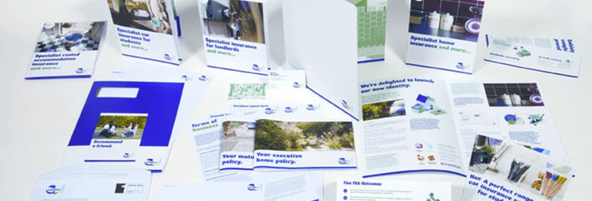
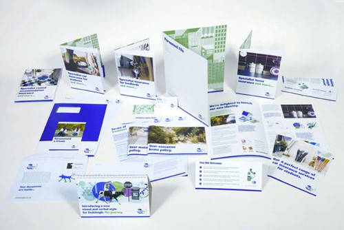
“The key thought behind Alex’s work was the idea of visually manifesting ‘back-up’,” says Ostrowski. “The new identity does this through the shapes that appear behind the wordmark and are cut through by it to reveal their dimensions. Alex then worked with YCN on developing the ‘family of shapes’ and the rest of the branding.”
YCN worked on typefaces and colours as well as the logo, and reskinned the business’ website, but a key challenge was to align Endsleigh’s tone of voice in its communications with the new brand positioning. “The house style had wandered into lots of jargon, and needed more pragmatic phrasing,” explains Ostrowski. “It’s a challenge for a company like this because of the regulatory guidelines from the FSA and so on – there are a lot of asterisks in Endsleigh’s communications – but its language and tone ought to exude positivity, not drift into being either overbearing or timewasting.”
“I would never say that Endsleigh micro-managed the work done by YCN,” says O’Connell of the collaborative branding effort, “but there was certainly a lot of conversation, a lot of debate.” Now, illustrations by YCN members decorate Endsleigh communications, in the brand’s new colours of green and purple, and are clearly credited to the recent graduates responsible.
From the start of the rebranding project, the plan had been for the launch to coincide with the busiest point in Endsleigh’s calendar – September, when students start at and return to universities and colleges across the UK. But prior to rolling out the new brand to customers, Endsleigh planned to reveal it to the stakeholders who’d truly inspired the new position: its own employees.
“We held the internal launch over a week,” recalls O’Connell, “and tried really hard to make sure the new brand was put into context for everyone, that there was total belief in and acceptance of the outlook Endsleigh was adopting. All passcards were switched for ones conforming to the new colour scheme, and when you handed in your old passcard and received your new we gave out free ice cream. Every employee received the ‘Bitesize Brand’ – a slimmed down version of the full brand guidelines that explained the basic mechanics of the new identity.”
Endsleigh also hosted a launch event for employees that provided examples of fantastic back up. Mountaineers Andy Kirkpatrick and Kenton Cool spoke about leading charity climbs and backing up people trying to achieve incredible feats; and Sarah Outen talked about the crucial importance of the back up provided by her logistics team during her 4000 mile, 124 day row across the Indian Ocean.
“We wanted to show our own people examples of back up in its true sense,” says Sharon Taylor, learning and development manager at Endsleigh. “The engaging and interactive stories from our speakers showed our people how our brand purpose could be brought to life, and proved that it doesn’t matter what job you do or where you work, you need a good team to back you up.”
Rapturously received by the Endsleigh team, the new brand also proved successful with Endsleigh’s core market – the students and freshers who encountered it across UK campuses in September 2010. Endsleigh is now starting to look at brand metrics and evaluation of the new identity.
As Ostrowski points out, the illustrations and continuing work YCN is doing with Endsleigh is a manifestation of the brand’s commitment to students and graduates: “It’s a living, breathing, changing brand, which brings in new blood constantly.”
O’Connell is more pragmatic about the new brand. “Our key stakeholders – including the NUS and the teachers’ unions – are very engaged with the new brand, and it’s allowed us to start work on a huge new project, ‘Get Going with Endsleigh’. The project is all about getting graduates to use their expertise to help other students in our supporting markets. It’s a continuation of the brand’s belief in the importance of back up.”
Peer reviews
Ian Allison, Bell Design
I remember Endsleigh from my own student days. If the brief was to refresh their visual identity so it appeals to students, this is a good start – though it’s not so successfully realised yet online. The challenge for any brand with an audience of young people is to avoid the ‘dad at the disco’ effect; Endsleigh have neatly sidestepped this by engaging their audience – via YCN – in the re-brand itself. With Endsleigh’s brand promise ‘We’re behind you’, using student talent also offers a big ‘Oh yes we are!’ reply to any potential ‘Oh no you’re not!’ from the student audience.
Stephen Judge, Bonfire Creative Intelligence
There’s certainly a youthful, student feel about the new identity. That’s great in the sense of targeting a niche market but I think it’s also important to recognise that students do not necessarily define themselves as students but as consumers too, and big fans of sophisticated and cool brands like Apple, Orange and Red Bull. Looking specifically at the logo, the broken shapes are slightly reminiscent of the 2012 Olympics logo and perhaps, when applied to a business rather than an event, that style conveys fragility rather than dynamism. Overall, I think this is a bold, positive step, and I hope it works for them.