ARCHITECTURAL ACUMEN
Engineering company Atkins has long been a leader in its field. But, establishing itself in the world of consultancy required a unique approach to brand architecture for the newly-formed Atkins Acuity. Brittany Golob reports
Engineering and civic design require precision, attention to detail and incisiveness. Global engineering firm Atkins has had that in spades since its doors opened in 1938. Born out of one man’s practice in Westminster, the second world war caused Atkins to grow into a national, and then international business. The company now counts four of the world’s six inhabited continents as its workplace.
And in addition to developing the Burj Al-Arab in Dubai, overseeing construction on the Hoover Dam Bypass in Nevada and building London’s Olympic Park, Atkins is now offering consultancy services.
The newly-created Atkins Acuity is part of the Atkins Group, but operates independently.
It offers strategic planning, operations, management and other professional services. Though this may seem a departure from engineering, Atkins has been involved in consultancy for many years. Clients came to Atkins for consultancy support based on Atkins’ history of expertise in engineering management and planning. One recent client sought out Atkins to help design a sustainable infrastructure for Egypt’s wastewater expansion. Over the years, more clients sought out Atkins’ expertise in areas such as this. But, the opportunity arose this year to differentiate these services from the core Atkins offering and allow for future growth in consulting.
“From that point on, it was our job to discover the best way of positioning the business, both within the market and within the Atkins Group,” Anthony Cox, head of strategy at brand consultancy Dragon Rouge, says. The London arm of the global firm was tasked by Atkins to create a brand for Atkins Acuity, position the new company and create a firmly differentiated brand.
Atkins wanted to launch the new brand as quickly as possible. And, with many of the consultants coming from Atkins itself, the focus was on the brand and positioning, rather than logistical concerns. Dragon Rouge began by examining Atkins’ wealth of case studies from its consultancy and did an audit of the market. “There was a real need for a challenger brand within the market,” Cox says. “There were a lot of quite cliché tropes and visual identity styles and ways of talking about people and it started to blend into one mass.”
Dragon Rouge found that major consulting firms were getting onto pitch lists because of reputation alone. Atkins Acuity, with a strong history, but a history in engineering and design, would have to fight for recognition and respect as a new brand. “If Atkins was going to play hard successfully in this market, it was going to have to buck the trend,” Cox adds.
Internally, Atkins already employed people offering these consulting services and employees who had joined from competitors, both of which were able to share insights on how a challenger brand could be modeled. Clients were also asked for their insights and opinions on how the brand should be shaped.
“From that point on, it was about developing a sharp proposition that we felt accurately represented what was unique about the Atkins advisory offer and how that could be best expressed in a way that started to carve out a role for it as a challenger brand within the market,” Cox says.
But, Atkins Acuity would still be part of the Atkins Group, a fact that lends it credibility, but one that could also confuse the brand positioning. Atkins’ head of brand Karen Howell says, “It was vital to leverage this while also communicating that Atkins Acuity is a new, different and exciting offering.”
That credibility and confidence came from within the business, but also from clients and peers in the engineering sector. In business terms, confidence helps Atkins win business and encourage investment in infrastructure on the part of governments and funding bodies. “That real confidence that clients need to have in the decisions that they’re making and the confidence that comes from having an end-to-end expertise model. Clarity is the ultimate benefit of being able to combine all of those hard hat and consultancy skills,” Cox says.
Thus the solution was an endorsed brand. Atkins Acuity is part of the Atkins Group and draws some cues from the Atkins brand itself, yet has decidedly its own identity. This unique brand architecture solution allows the two companies to maintain their own areas of expertise, but to develop brand awareness in two sectors, rather than just one.
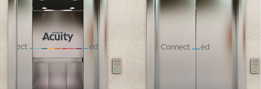
The name Atkins Acuity informed the visual identity because it is synonymous with sharpness of thought. The wordmark ties the two organisations together. Atkins keeps its typeface and identity. However, in the word acuity, the bridge on the A is reimagined as a highlighter marking. This becomes one of the key devices used throughout the visual identity.
The highlighter mark helps navigation online, differentiates Atkins Acuity from Atkins Group and acts as a device through which the brand can tell stories and share information. In effect, it unifies the brand. “It was about simplicity, clarity, confidence and navigation through storytelling,” Cox says.
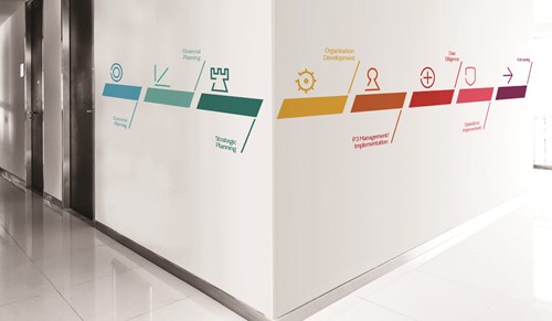
The web design is carefully constructed, as it is the key brand touchpoint. It features a main page with a consistent downward flow of information. From this one page, or the navigation bar, users can access all of Atkins Acuity’s services, thought leadership, team and contact information. It is intentionally simple and uncluttered to reflect the brand’s positioning. But, somewhat uniquely, the page begins with a definition of the word acuity. “The hierarchy of information was very much based on what we know to be key needs from clients and the reassurance of getting straight to expertise. Being very clear about being powered by the engineering expertise of the Atkins group and showing the services that it offers, felt like the right hierarchy,” Cox says. The site emphasises Atkins Acuity’s experience, legacy and client work through case studies.
Photography is, for a consulting company, vibrant and colourful. The tiling of the online case studies highlights the geometric aspects of the chosen photography. Cox says the photography is intentionally not of experts in suits discussing strategy. Dragon Rouge wanted the photo library to be of the people Atkins and Atkins Acuity have actually helped through their work while, at the same time, humanising the company. This is most apparent in the unusual, smiling headshots of the Atkins Acuity team. “These are people dealing in huge projects, with huge budgets and great responsibility. But they are a set of very down-to-earth people. That needed to be represented in the way that we represent them in photography,” Cox says.

The relationship between Atkins and Atkins Acuity is a finely-balanced thing. Dragon Rouge worked with Atkins to determine how closely the two would be linked. Ultimately, Atkins provides the credibility, and the typography, while Atkins Acuity can act independently. “We need to think in fresh ways to get our point of view across,” says Howell. “Not relying on literal photographic project content and focusing on the benefits of our work for our clients and to communities and the perception we want to create for the Atkins Acuity brand. This has been a challenge and steep learning curve for those creating content.”
Before the 20 July brand launch, Atkins announced the new brand to the Atkins Acuity employees in a global, live video, town hall meeting. Then, teasers were sent out to Atkins employees worldwide followed by an internal launch using the intranet, a message from the CEO and animated content aired in Atkins offices.
Despite Atkins Acuity’s differentiation from the rest of the market, long-term growth is still the goal of any consultancy firm. And, for a 78 year-old business, Atkins sets a good example for its new offshoot, and adds that heritage literally to the wordmark. Thus, the challenger mentality designed to launch Atkins Acuity will also prepare it for growth. Cox says the challenger brand approach is scalable because its about mindset, rather than size. If Atkins Acuity can maintain its client focus, its agility and transparency and its clear point of view, it will be able to do so.
Atkins Acuity was only introduced to the world in July. “The challenge going forward is for the people who are out there on the front line with clients to be selling and delivering on all that the brand stands for in a consistent way,” says Cox.
With existing work by Atkins Acuity spanning from transport infrastructure development in Turkey and the Gulf to sustainability in sub-Saharan Africa to climate change management in Sri Lanka, the 78 day-old brand (at time of writing) is already echoing Atkins’ foundations in strong, international, expertise-led work. If the company will reach its 78th birthday, only time will tell, but the future is bright for a company built on keen perception and sharpness of thought.
Peer review
Stephen Judge, founder and strategic development director, Bonfire Creative Intelligence
As I set about doing my research for this piece, already being familiar with Atkins, the global design, engineering and project management company, I was excited to learn about this extension and see how the company had tackled the launch of its new advisory business, Atkins Acuity.
When reviewing the launch or evolution of a new or existing brand, it is easy to get into a creative critique. We have to avoid subjective feedback on ‘design’ without the insights that led to the business proposition, the brief, understanding the relationship dynamic between key stakeholders and, of course, the budget. There are a couple of fundamental questions we can ask though: what is our first impression of visual branding and is the brand purpose clear?
With this in mind, I visited the new website. The branding is simple and, most importantly, leverages the equity in the parent brand. The website is clean and easy to navigate, but I do feel that the overall messaging could have reflected the global, listed status of the parent brand more. Having also found and read the press materials for the launch of Acuity, and come away with a clear understanding of the proposition, I was a little frustrated with my first scroll on the website. The site proudly starts with a definition of the name Acuity (/ə’kju:rti/noun - SHARPNESS & CLARITY OF THOUGHT & PERCEPTION.”) and continues with, “We help clients with big infrastructure and energy ambitions to get the best outcomes,” which in all honesty, and with no disrespect, is anything but clear.
Given Atkins’ heritage and the nature of the offering I would have expected a more articulate explanation of the company’s services within the first two statements on the site. Overall I think it’s okay and Atkins is a big company that knows what it is doing. The visual branding is okay, it may even be perfect if I had the brief to review it against. But is the brand purpose clear? I would suggest not as clear as it should be.